Fonts for Der Spiegel
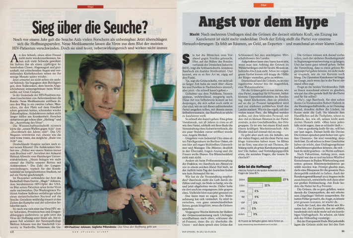
Germany’s Der Spiegel is based in Hamburg, where it was founded in 1947. Uwe Beyer redesigned the news magazine in 1996, and for this, he was planning to pair Linotype Rotation for the articles’ main text with headlines in Franklin Gothic Extra Condensed. While Luc(as) de Groot visited Hamburg to give a lecture about the design of the upcoming Expo 2000, the two met. Beyer showed his upcoming redesign to Luc(as).

Introduction
Since Luc(as) found Franklin Gothic a little too generic, he offered to design a replacement font for Der Spiegel’s headlines. A newly developed typeface, he argued, would lend an unmistakable personality to the magazine. Still in his old job at MetaDesign, Luc(as) worked late nights for a week and sent in sketches; Beyer ordered six weights immediately.
Beyer’s redesign of Der Spiegel must be viewed as an unquestionable success. The magazine’s structure has remained amazingly consistent for the past 22 years, even though small changes were later made to it by Beyer himself, about a decade ago. Meanwhile, Luc(as) built up a typographic arsenal for Der Spiegel’s editorial designers.
Already in 1996, Luc(as) began the first in a long series of updates to the Rotation fonts. These included adding old-style figures and small caps. Arthur Ritzel at the old D. Stempel AG foundry in Frankfurt designed Rotation in 1968. Ritzel was the head of the company’s engraving department, and his design was initially released in 1971 as matrices for Linotype’s hot-metal composing machines. The typeface was for newspapers printed in relief on rotary presses. In terms of its appearance, it looked back to Times New Roman. Indeed, before Beyer’s redesign, Der Spiegel’s pages had been composed with Times New Roman and Franklin Gothic.
Over the years, Luc(as) began to notice that old-style figures were used significantly less often in German typography than in his native Holland. The Times New Roman used by Der Spiegel until the end of 1996 hadn’t used them either. After the first issue of the redesigned Der Spiegel hit the newsstands in January 1997, with his old-style figures added to Rotation, Luc(as) could ease clients’ reluctance toward using old-style figures by saying “see? They’re in Der Spiegel!” This gave them instant credibility with Germany, and besides – old-style figures make text look better, too.
SpiegelSans
While the SpiegelHeadline font drawn to replace Franklin Gothic was sold to Der Spiegel outright, Luc(as) designed the other six sans serif fonts as non-exclusive products. Their initial delivery was by modem (that’s how long the fonts have been around …). Together with his first assistant, Dmitri Sorokin, Luc(as) later expanded those two regular-width and four condensed-width fonts into the LucasFonts families Spiegel and Spiegel Condensed, which were first released to the public in 1999/2000. Over the years, the weight ranges of those families increased even further. Der Spiegel’s designers now have eight weights of each at their fingertips, all with companion italics.
The next generation
But this wasn’t a large enough of a sans serif palette for Luc(as). To give Der Spiegel’s designers even more flexibility, he replaced his Spiegel Headline font – which had originally just been one style – with a series of eleven ExtraExtraCondensed styles.
SpiegelSerif
Let’s pause for a moment to talk about printing technology. In 1997, Der Spiegel was printed on rotogravure presses. This produced brilliant images varying not only the size of the dots making up the image but also the ink density. The dots making up the text’s letterforms are also drilled into the cylinder, which resulted in text that felt warm, and was very readable. Over the next two decades, printed journalism went through a number of changes, as the Internet became an ever more important source for reading the news. Changes in print-media readership led to offset printing becoming the more economical option for Der Spiegel, and the magazine switched its production method in 2016.
The change to offset printing necessitated further work on SpiegelSerif, Der Spiegel’s version of Rotation. Luc(as) proposed two possible solutions. The first was a fon that would simulate the look the old font had when printed in rotogravure. He called this eine Tiefdrucksimulationsschrift. Since each letterform in rotogravure printing is rasterized individually and therefore made up of different dot constructions, Luc(as) included alternate letterforms in this font. If you look at the image below, you can spot at least three variants for the lowercase e in the text.
Luc(as)’s second suggestion was to provide Der Spiegel with four “grades” of SpiegelSerif. Each grade had a slightly different weight, and testing these allowed the editorial design team to find the optimal one for printing the magazine’s text with on their offset presses. Der Spiegel eventually selected one of the heavier of these grades, instead of the simulated rotogravure-rasterization font.
While creating the SpiegelSerif, Luc(as) took advantage of the opportunity and modernized many of the typeface’s features. For instance, he replaced almost all the lowercase letters’ terminals with more contemporary forms. He added additional weights to SpiegelSerif’s range.
Subsequently, FontFabrik expanded SpiegelSerif into two families: SpiegelSerif Text and SpiegelSerif Display. Although related to SpiegelSerif Text by history and style, SpiegelSerif Display is an original family created for Der Spiegel’s editorial designers to use in headlines or other larger-than-text sizes.
SpiegelSerif Display has four weights and they are all heavy. Each of those has an italic, just like SpiegelSerif Text’s weights. The family members were each optimized for particular sizes ranges. For example, a weight called DisplayBlackTitle was designed for medium-sized text, while SpiegelSerif Display’s Bold, ExtraBold, and Black weights were designed for big-sized text. The “Displayschriften” image above is set with the SpiegelSerif Display Black and SpiegelSerif Display Black Italic fonts.
Slab serif typefaces, too
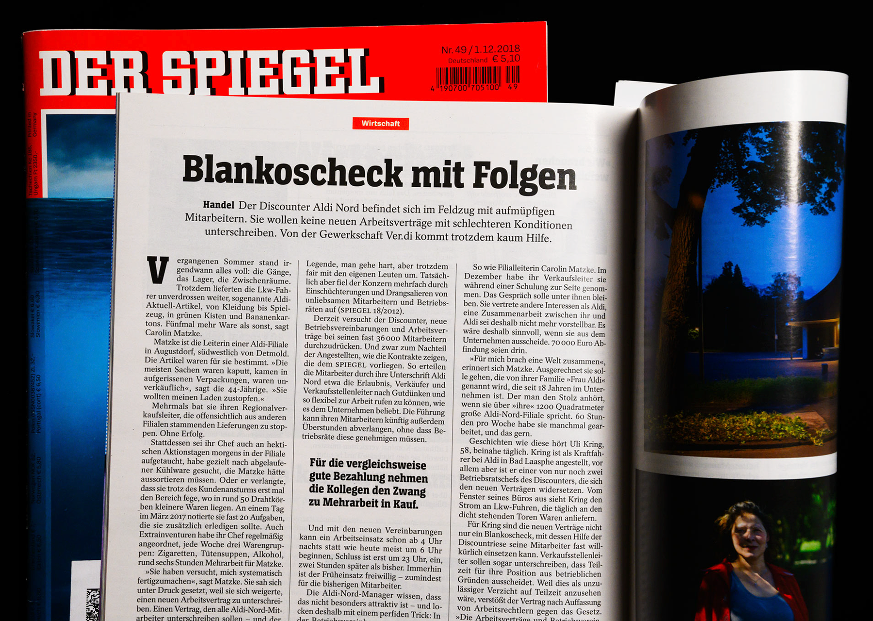
Since the letters on Der Spiegel’s nameplate are slab serifed, the next logical step for the magazine’s editorial designers was to add slab serif fonts to their font palette.
For many people, the most iconic part of Der Spiegel is the magazine’s nameplate. This nameplate (or “logo”) has always been hand-lettered; however, its letters’ appearances bear a strong resemblance to the fette City (“City Black”) typeface designed by Georg Trump for H. Berthold AG in 1930. Nevertheless, the differences between the eight letters in Der Spiegel’s nameplate and the City typeface are significant enough that City itself doesn’t necessarily look like “Der Spiegel.”
Luc(as) created a new multi-weight upper and lowercase typeface family that is exclusive to Der Spiegel, which the magazine’s editorial designers now deploy for special occasions.
FontFabrik also developed a slab serif family based on SpiegelSans and SpiegelSans Condensed. When work started on this design in 2016, three upright weights were initially developed – Regular, SemiBold, and Bold – but SpiegelSlab and SpiegelSlab Condensed were soon expanded to eight weights. Since 2018, Der Spiegel’s designers have used those families for headlines and subheads throughout the magazine.
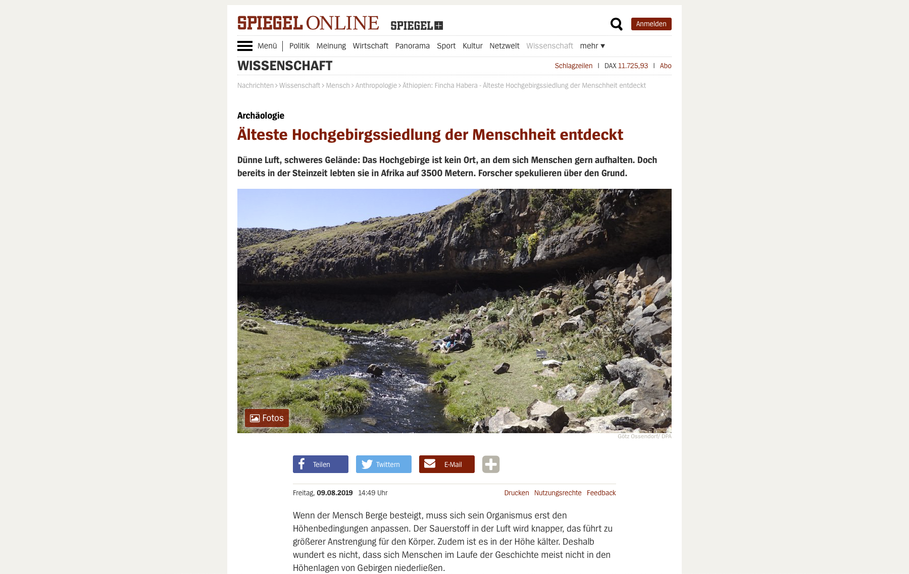
In 2016 – around the same time that Der Spiegel switched from rotogravure to offset printing – the Spiegel Online website underwent a redesign that saw almost all the website’s text displayed with the SpiegelSans fonts. Even the body text of each article was set with those, instead of the SpiegelSerif the printed magazine employs. When delivering Der Spiegel with all the new SpiegelSans, SpiegelSlab, SpiegelLogoFont, SpiegelSerif Text, and SpiegelSerif Display fonts, we provided .WOFF files in addition to .OTFs.

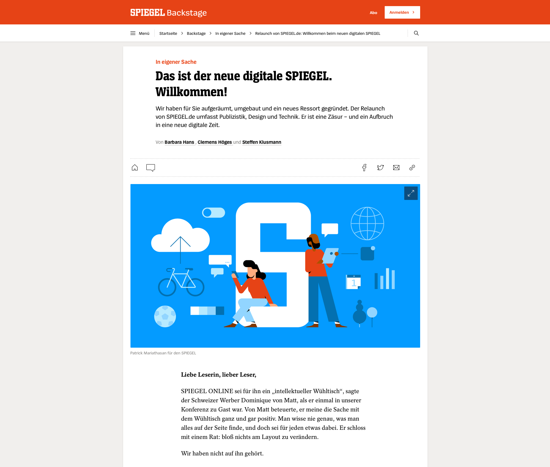
To ring in the new decade, in January 2020 Der Spiegel redesigned its website again. This refresh saw the website’s layout move closer to the design of the printed magazine. The website is no longer called Spiegel Online but just Der Spiegel. Like the magazine, the website’s 2020 redesign specifies SpiegelSerif for article texts. Headlines are set with SpiegelSlab. You can still find SpiegelSans in the layout, too. We are excited to see how this presentation of the news will change over time.

Final thoughts
Each printed issue of Der Spiegel contains unique content, yet the magazine itself remains the same publication every week. This also applies to the website – Spiegel Online is Spiegel Online, even though its editors refresh the content continuously. A magazine and its staff’s typographic needs change over time, both because of evolution in ideas about visual design and structure, as well as because of technological developments like the introduction of new page-layout software or font-embedding on websites.
Redesigns respond to changes in fashion. A design will only stay fresh for so long. Then it needs to be renewed. With established publications, changes are typically introduced incrementally. Luc(as)’s designs for Der Spiegel are the result of – and an excellent example for – a successful long-term collaboration between a magazine and a font provider. His work has helped the face of Der Spiegel’s journalism evolve incrementally for decades. Their relationship has been pretty long; Luc(as) was drawing letters from Der Spiegel before he even founded FontFabrik and LucasFonts. This kind of collaboration helped enable subtle design revisions over the years, keeping the evolution of the fonts “within the family.” Would SpiegelSerif have been as good a match for the magazine’s other fonts, if they hadn’t come from Luc(as)?
