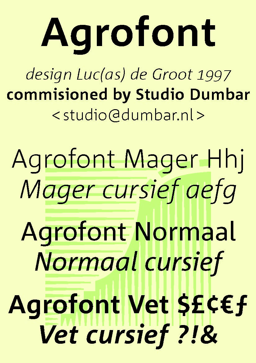
Agrofont
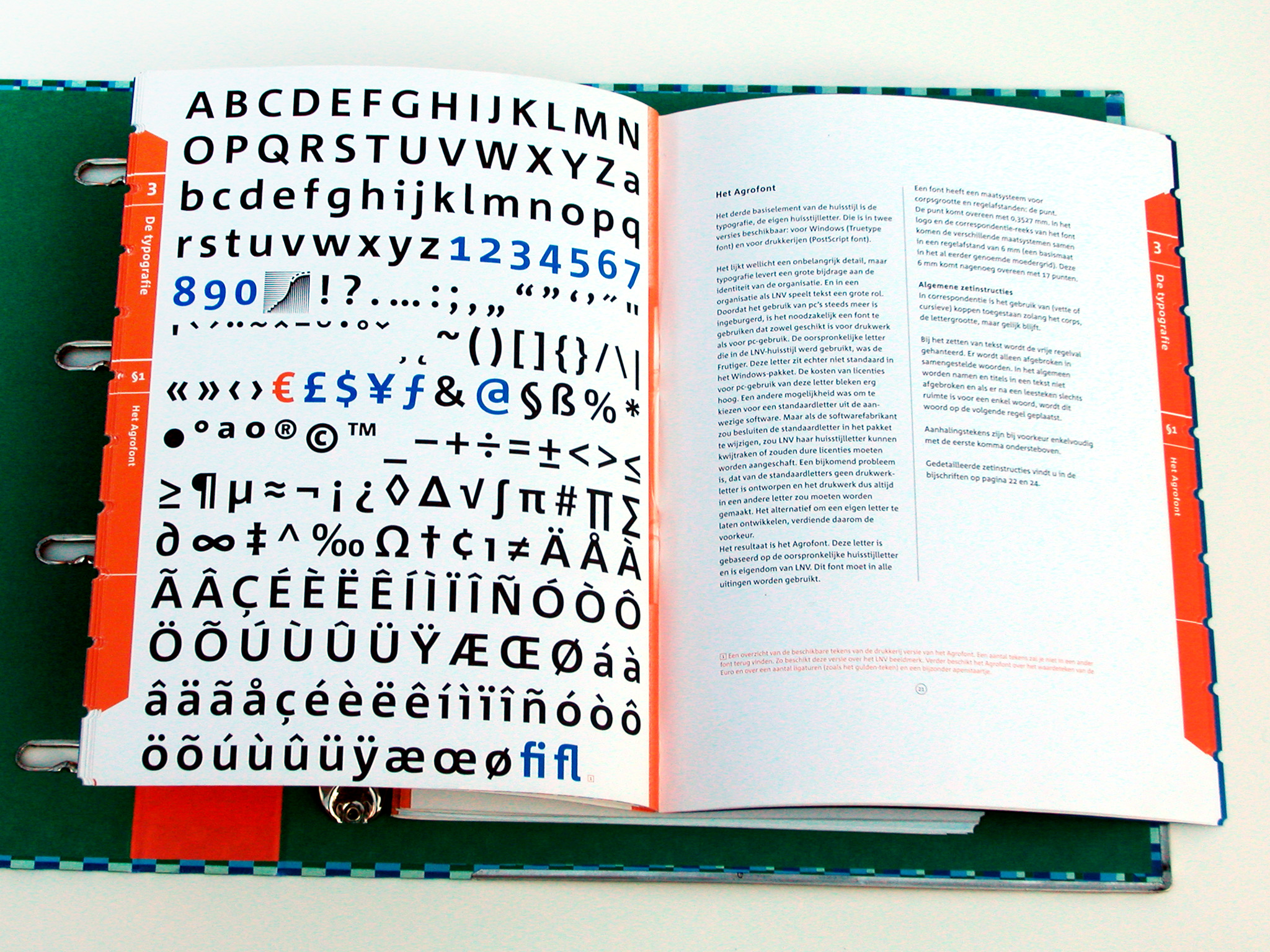
The name Corpid derives from corporate identity – which is what this family of low-contrast sans-serifs was made for. Corpid (then known as Agrofont) was originally commissioned by Studio Dumbar in the Netherlands as a corporate typeface for the Dutch Ministry of Agriculture, Nature Management and Fishing. Having been invited to conduct a major overhaul of the Ministry’s identity and adopt init to the new, PC-based communications structure, Studio Dumbar advised to replace the existing typeface, Frutiger, with a newly produced font family. This would not be costlier than purchasing licenses to the existing font for all of the Ministry’s comports; it would give the Ministry a unique and strong identity.
Part of the briefing was to make the regular weight similar to the old typeface in text colour and size, so that the vast amount of existing documents could be transferred to the new font without creating confusion.
The overall look, however, turned out distinctly different. This was in part a result of what Luc(as) calls creating tension between the inner and outer curves of each character. ‘I tend to put a little more diagonal contrast into fonts than is the case in most neutral sans serif fonts. This brings a certain humanistic touch to the typeface. Much more subtle here than in Thesis – but although it is almost invisible, it is still palpable.’
Corpid was gradually expanded into a five-weight, three-width family. The Semicondensed especially is very legible even at small point sizes and works well as a space-saving text face. With its wealth of numeral styles and international character sets – including Greek and Cyrillic – the Corpid family is now well equipped to tackle the most complex of typographic tasks.