Sun
Sometime around 1994, Erik Spiekermann sent Luc(as) to Rotterdam to give a lecture in his place. Once he was there, he met a young designer named Chris Haaga, who was interning at the design studio Hard Werken. Luc(as) gave the Hard Werken designers a floppy disk with some of his more experimental type designs like JesusLovesYou and Punten, and Hard Werken used these in Blvd., a cultural magazine. Although this was the height of the grunge era, there still were not all that many grunge fonts available yet.
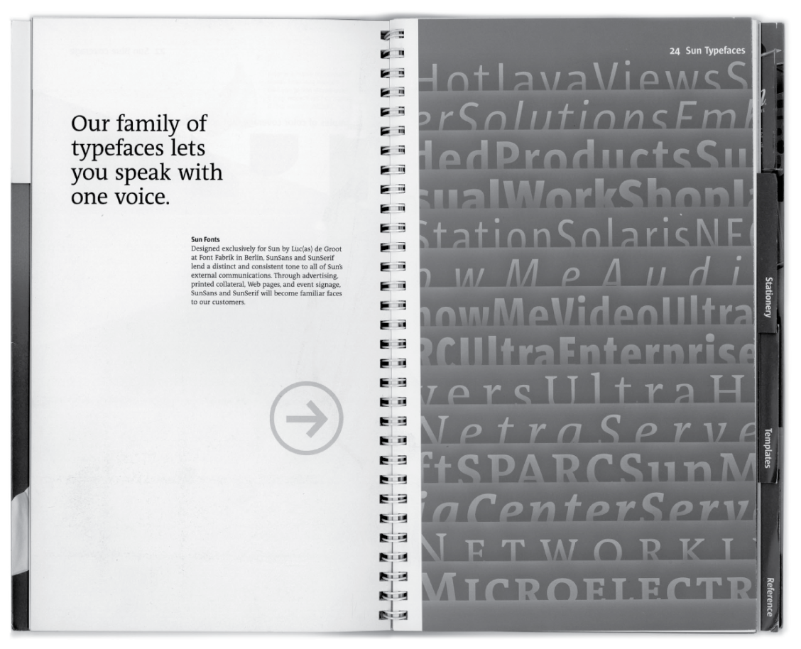
After Haaga went back to the United States, he eventually began working at Sun Microsystems. Haaga commissioned Luc(as) to design a custom typeface for the company. He had some specific fonts he suggested as models, including Barmeno from Hans Reichel. These were all fonts that were completely different from the kinds of letters Luc(as) usually designed, and he had to struggle to arrive at a good solution. At the Royal Academy of Art in The Hague, Luc(as) had learned all about letterforms based on broad-pen and pointed-pen calligraphy, but there are also typefaces outside of these spheres, and it exactly in that direction that Haaga wanted to Luc(as) to go.
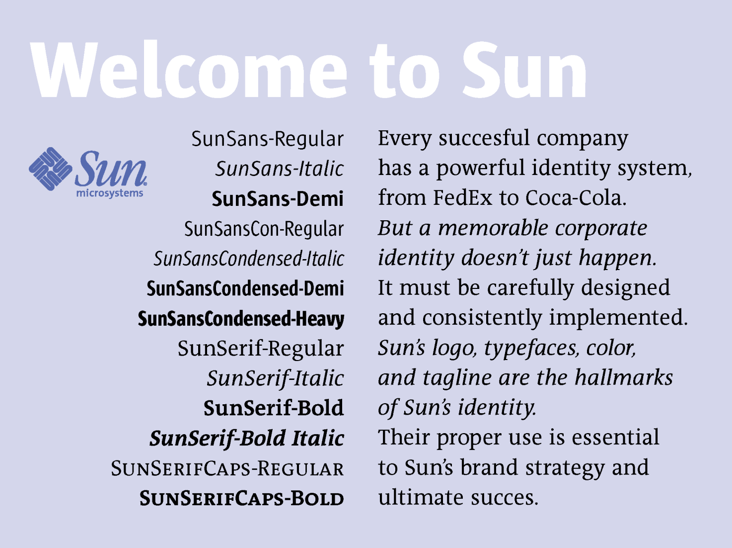
The result was Luc(as)’s Sun typeface family, or at least the first version of what eventually became that retail product. First, the period of exclusivity that Sun had paid for needed to expire. Luc(as) also developed a companion family of serif typefaces for Sun, which he based on his then still-in-progress TheAntiqua design. Like the sans serif Sun family, this serif TheAntiqua Sun family eventually became a LucasFonts retail product.
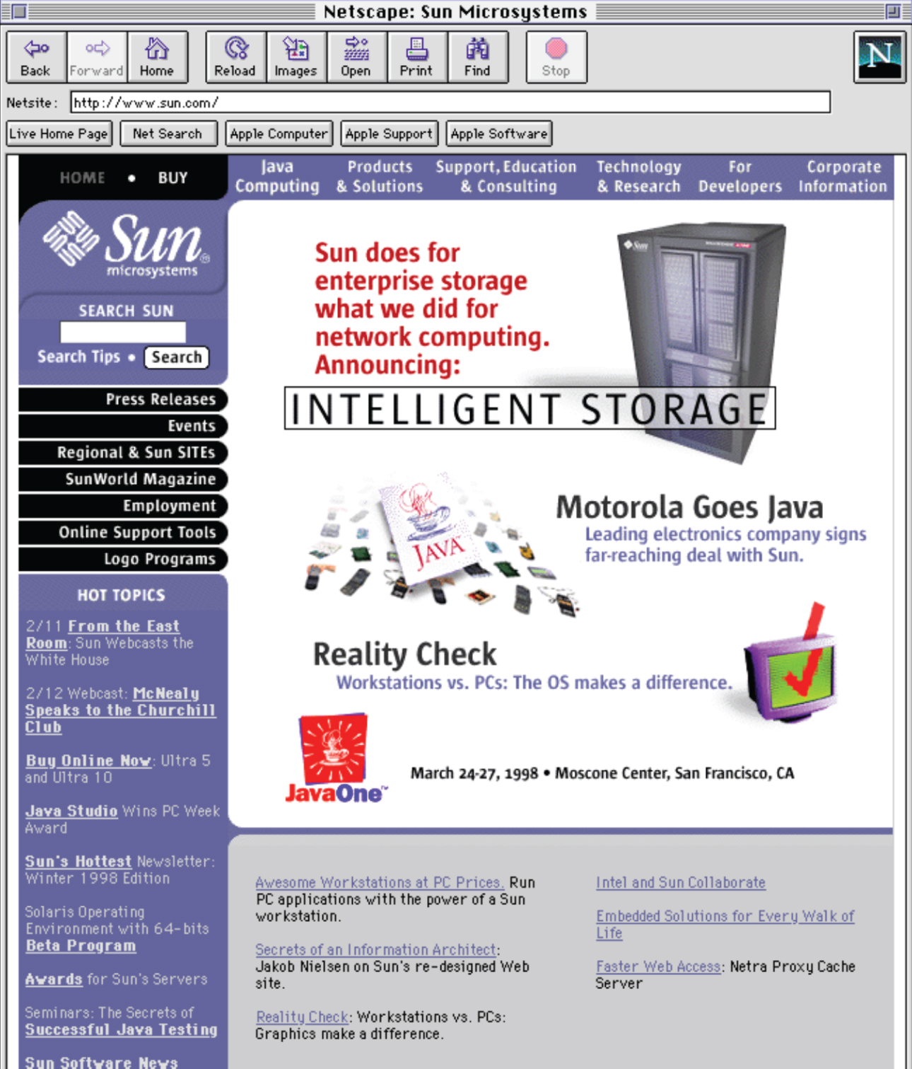
Sun mixed Luc(as)’s new fonts together with a fantastic purple corporate color, creating an identity for the company that was really distinct. It still looks good today, even though the firm is not in business anymore.
Sun and TheAntiqua Sun, by the way, were designed in an old editor called Font Studio. It was from Letraset, and it was really great! TheAntiqua Sun initially had separate ‘Caps’ fonts (i.e., fonts with small caps in lieu of lowercase letters), since InDesign was not yet on the market and older page-layout applications like QuarkXPress wouldn’t support OpenType features for years yet.
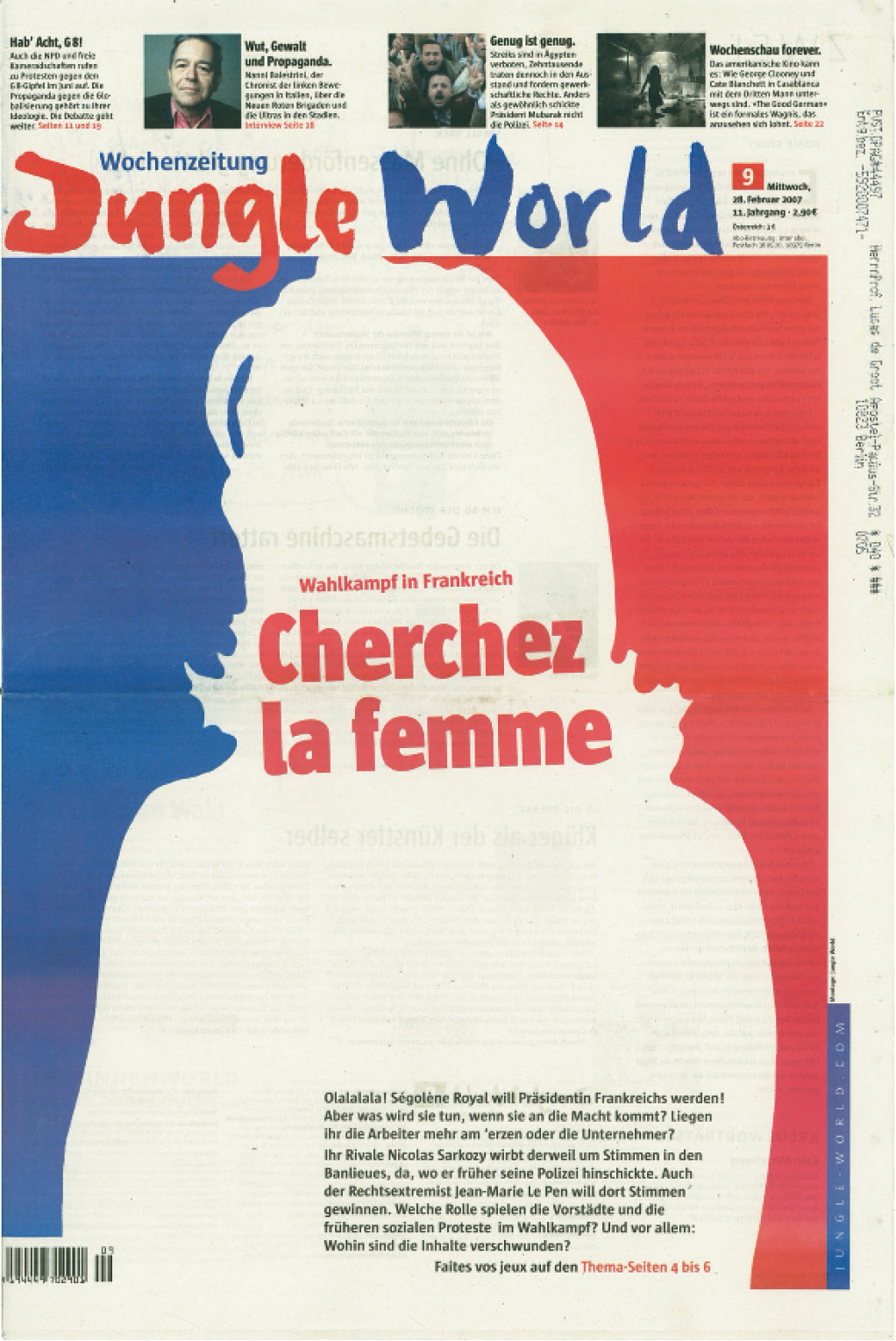
The next FontFabrik client to use the sans serif Sun fonts was a Berlin-based newspaper called JungleWorld. Eventually, both Sun and TheAntiqua Sun became the official fonts used of the corporate design of the FH Potsdam, the school just outside of Berlin where Luc(as) has been a professor for type design since 1997.
The retail Sun typeface was greatly expanded to include a number of weights not present in the original version used by Sun Microsystems. This extension also included condensed styles. The various intermediate weights of the commercial Sun fonts don’t match the weight and width of the original corporate fonts, but the larger family is undoubtedly better and riper. This revision was also the first project that Luc(as) undertook in FontLab instead of in Font Studio. As of this writing (2020), Luc(as) remains a tremendous fan of FontLab’s software, preferring FontLab Studio 5 especially over any other font editor currently on the market.